Cocktail Bar Trailblazer
28 HongKong Street
With it’s award-winning barman and contemporary social food, 28 HongKong Street has all the right ingredients for a fine night out.
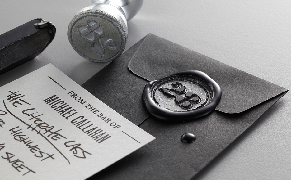
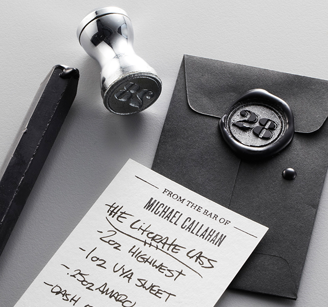
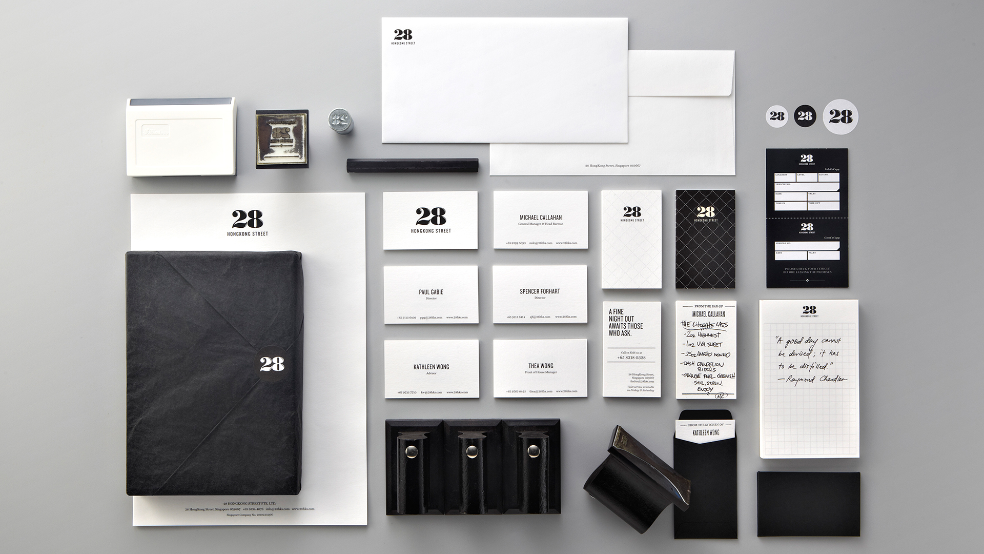
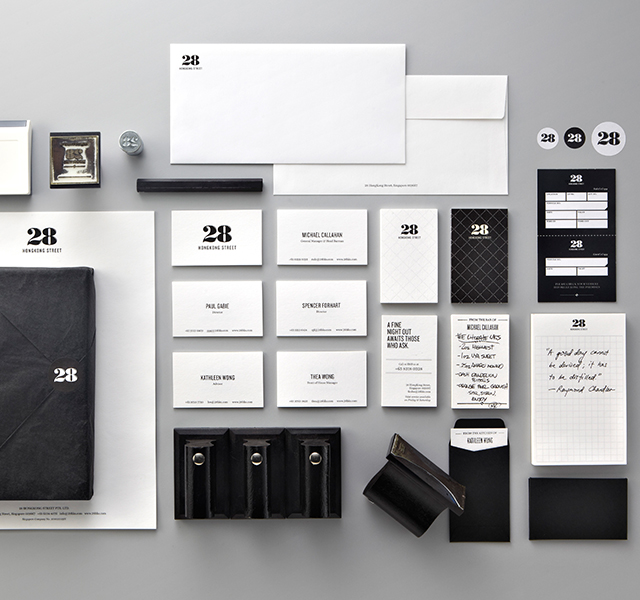
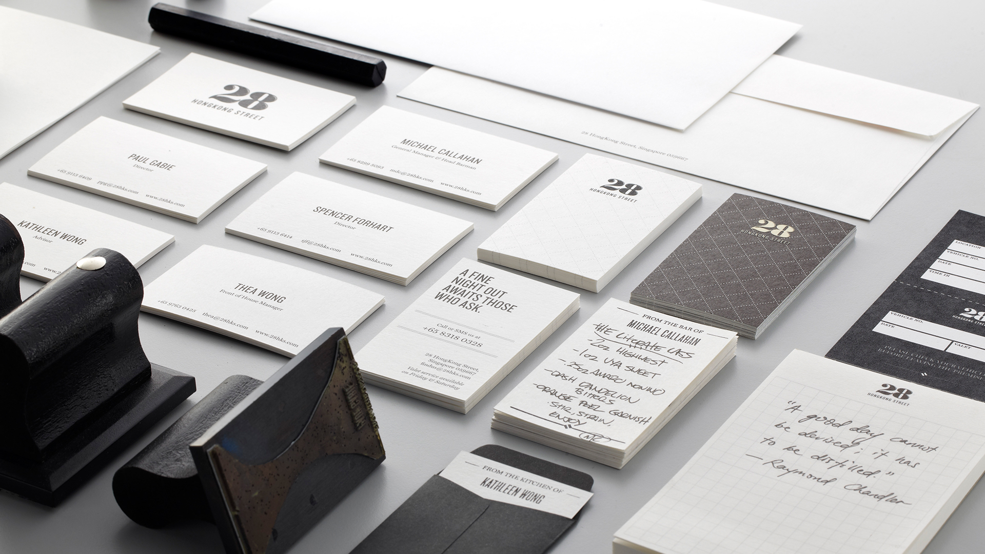
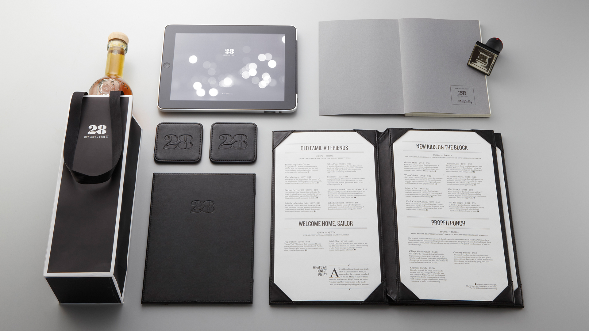
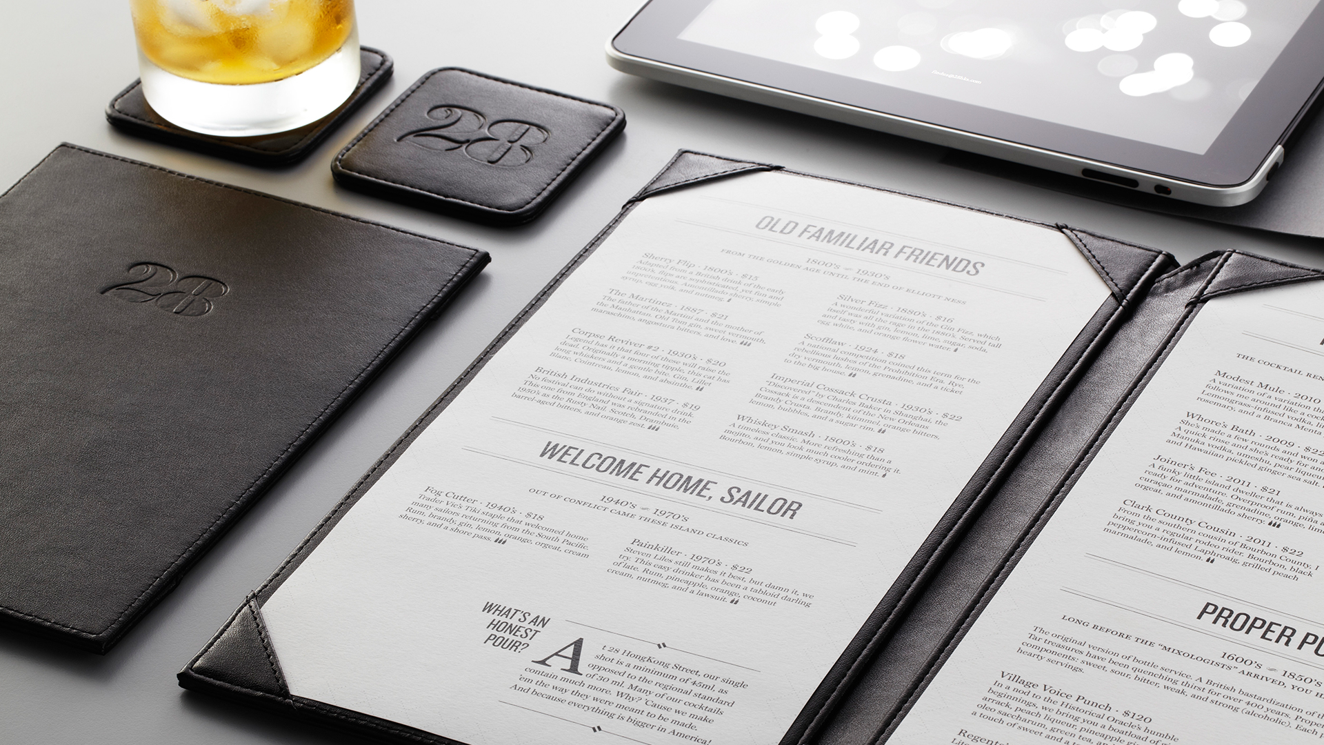
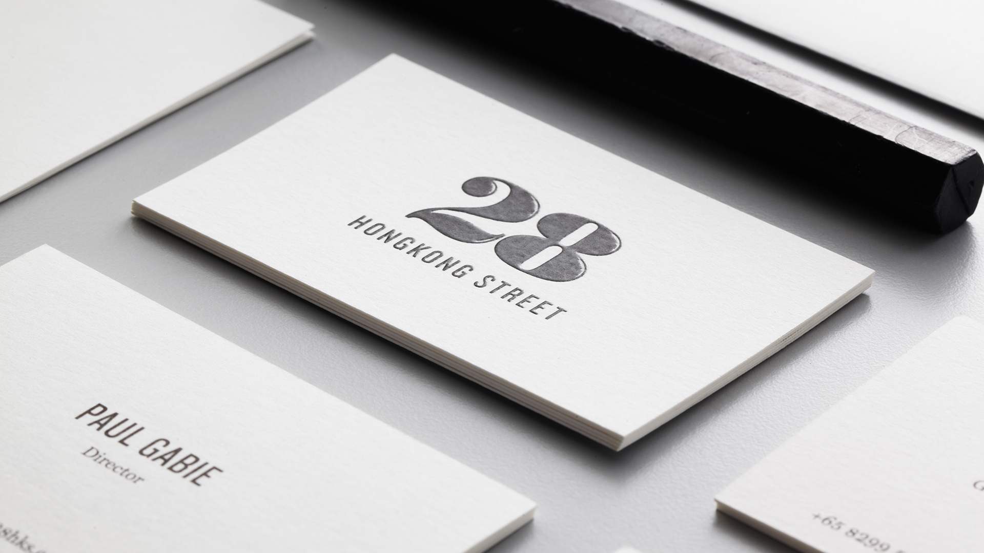
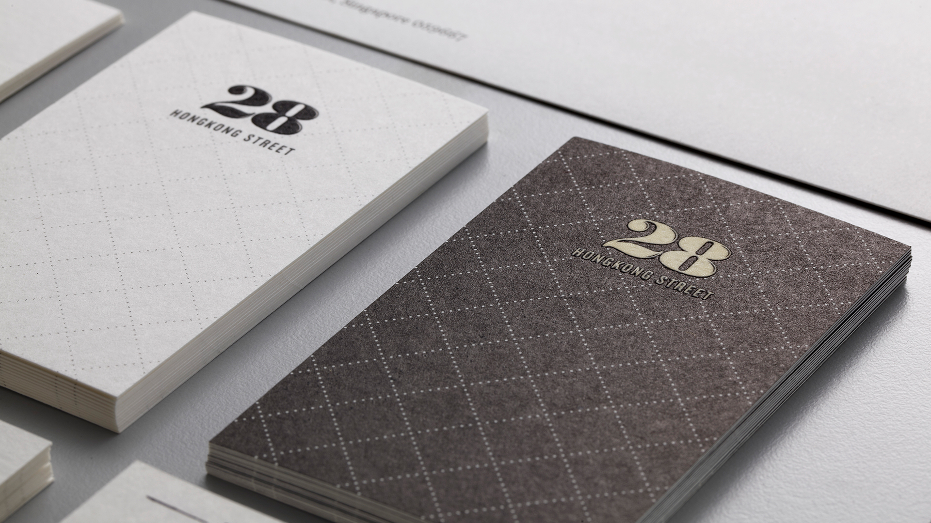
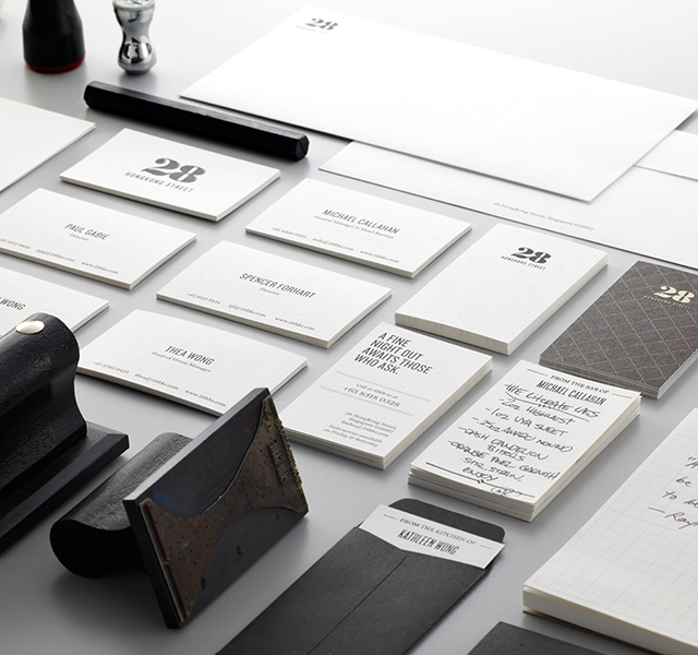
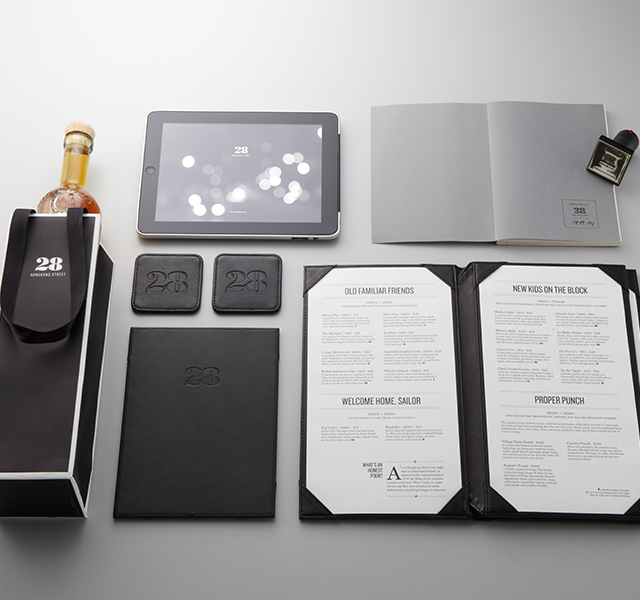
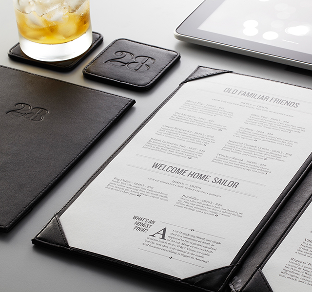
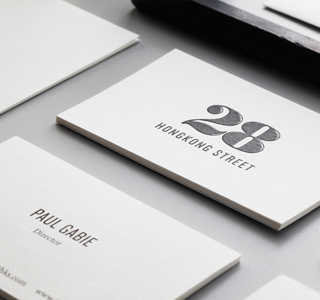
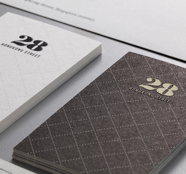
The logo was designed to be both elegant and modern. We topped off the classic Bodoni “28” with highlights – a gleam of something unexpected on an otherwise conservative font. For typefaces, we paired the bold and functional Knockout with the respectable and classy Miller. A lot of thought went into the finishing of the brand collateral – the little details that would leave a subtle but lasting impression. We used powder matte black embossing, which is fantastic to touch. Nearly everything was tactile, from the paper texture to the leather coasters.
A fine night out
A balance between extremes
The client came to us looking for a brand that was both classic andcontemporary; that spoke sophistication without snobbery. They believe that good is not the same as fancy, and that quality does notnecessarily equate to expensive.
